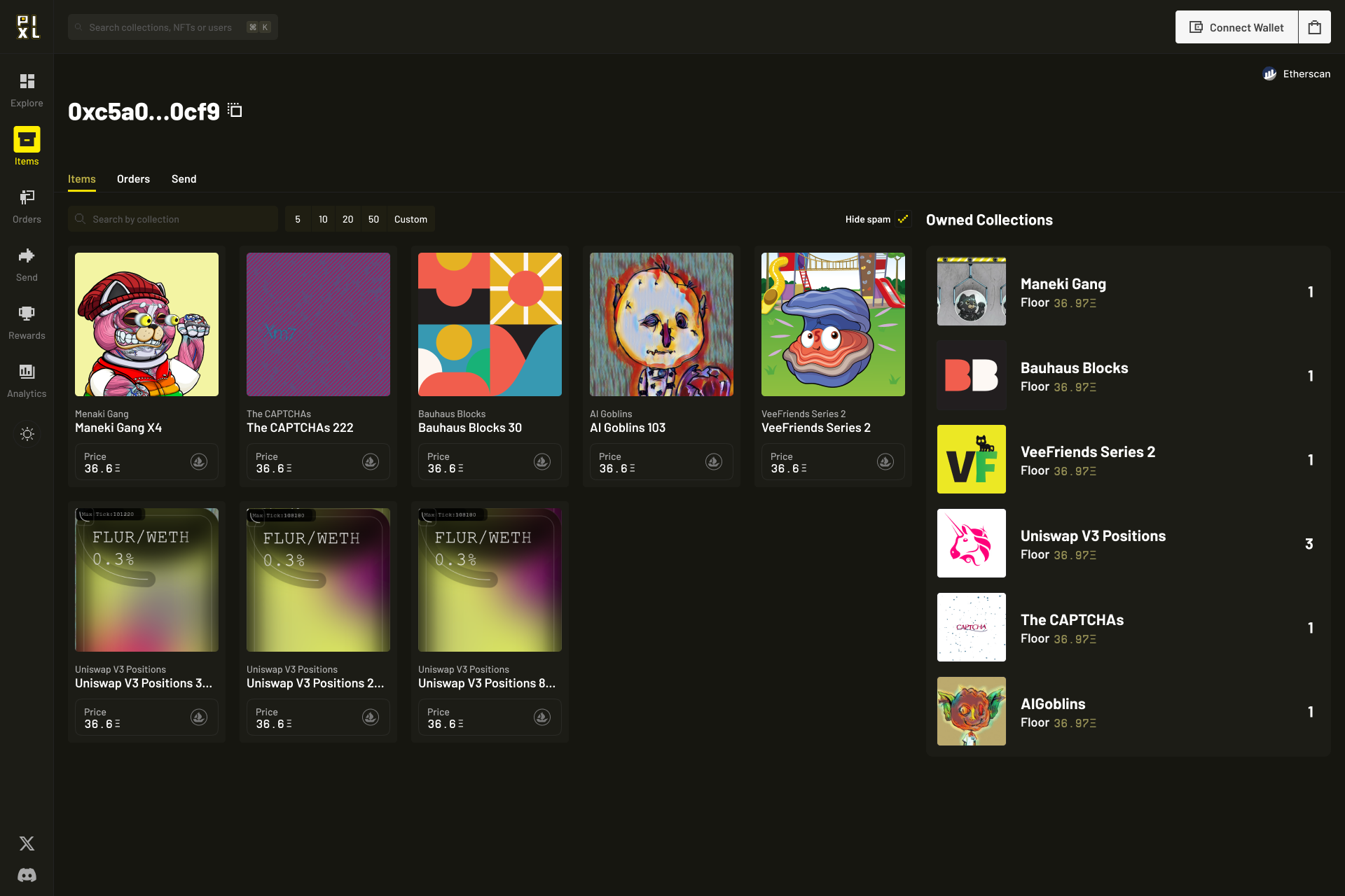
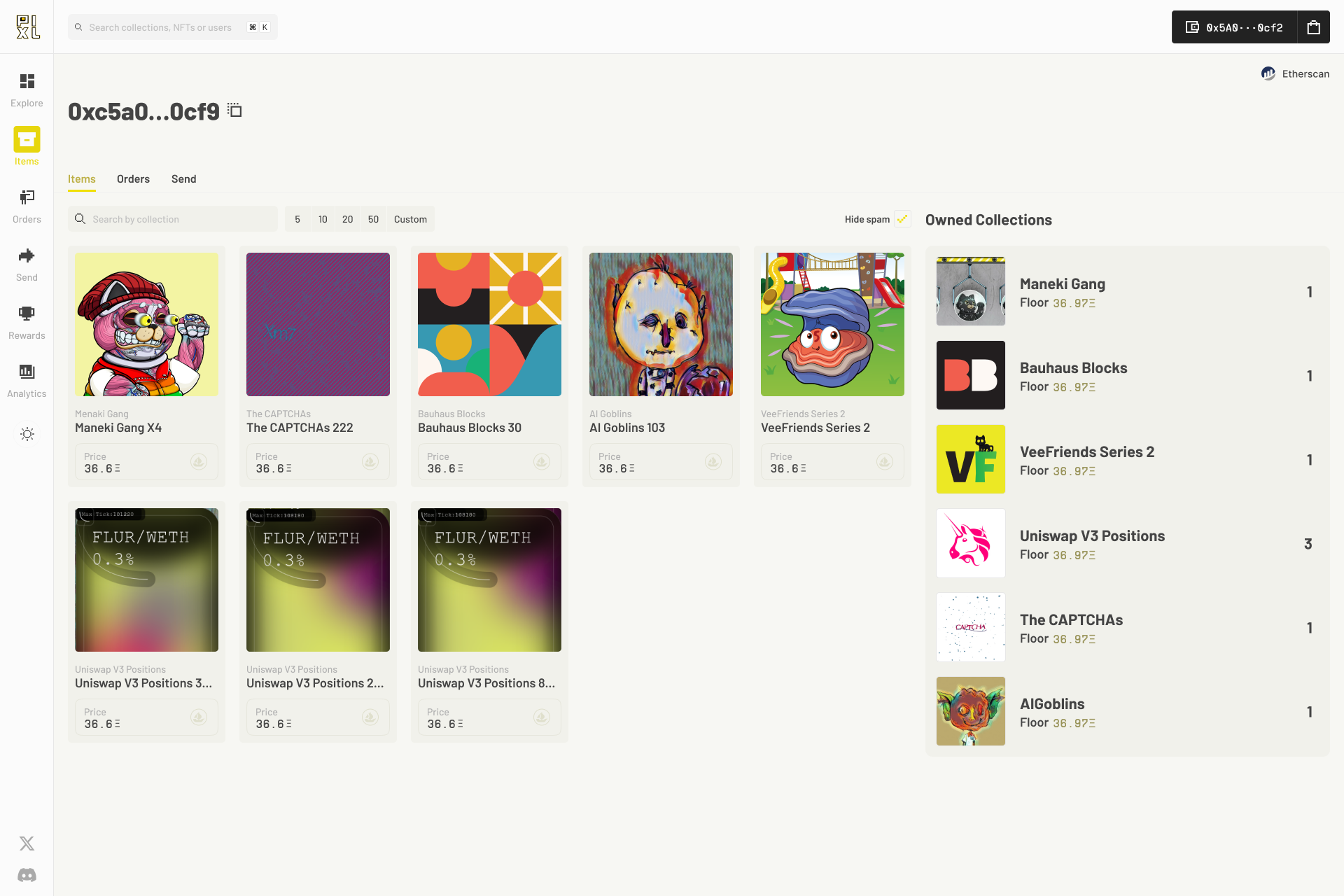
The previous fonts (Monument and Neue Machina) had a bit too much verve to it, so I conducted a bit of comparative research to choose some fonts that were a bit more laidback. We ended up selecting Inter and Supply Mono because they communicate the brand in a way that feels precise, and authoritative.
The UI was also completely outfitted with a custom-designed set of pixel art icons.


